CLIENT SHOWCASE
Photography, Image retouching and InDesign work for Bop Consulting.


The Brief
-
Typography: Any style of typography with the words : "The Lambeth impact study, Summery report"
-
Background: Halved, with one side being blue and the other black
-
Object/landmark or person embedded into the page
The Journey
I first went to different locations across London taking pictures of people and landmarks and settled on a person a took a photo of smiling, I then retouched the image using Photoshop and added the new image to a template using InDesign.
Design work for BAAWA a food and delivery business

The Brief
-
Colours : Red, yellow green and white
-
Company logo with taglines included
-
Company details to be included i.e location, listed items, numbers
-
object or or person embedded into the
The Journey
This commission was for a company in London and Manchester. Here i created placard for them. I created the background and foreground using a mixture of Photoshop, Illustrator and Coral draw. Then I printed it all on Semigloss paper for that shiny effect.
Design work for a clients self publishing a book series


The Brief
-
Colours : Any
-
Theme: Owl x 2 ( for two separate paperback book covers)
-
Tagline: Give a hoot! placed underneath the owl
-
Typography: Any typography style/font
The Journey
A approached me and asked me to create two book for their inaugural children's book series that they intended to self publish. The brief was to create one main cover and one alternate cover both with an Owl theme with the text tagline "Give a Hoot" underneath the Owl. I created these two versions solely with Illustrator.

Logo Design work for a clients Talent and Acquisition company
The Brief
-
Colours : Neutral (white) background
-
Typography: Any (in the foreground),
-
Main text: Coelle Ldn in capitals in black
-
Theme: waves/clean/fabric, Static undulating
-
Wave colours: Any
-
Tagline: " Global assets under management"
The Journey
A Logo I created for a talent acquisition management company named Coelle Ldn. Created using a mix of Photoshop and Illustrator. This had several layers while in Photoshop and typography within illustrator. I also researched and incorporated wave like structures that was also fabric like and undulating yet static.
Logo Design work for a client

The Brief
-
Colours : Red and Black with a white background
-
Theme: Stars
-
Font : client picked a slightly dis-fluent font overlaid with red and black colours
-
Text: All star team, Incorporating an actual star in combination with the text
The Journey
I was approached by a client who viewed my work online and asked me to design a logo but one that would be printed on a t-shirt . This was admittedly a little rushed, and I realized later that how the text is arranged can affect the perspective of the viewer. One person may look at this and read the text as "all Star Team" while another person may look at this and read the text as "Tall Team" with a star logo. It shows that perspective and text arrangement can change the intended message dependent on how the viewer perceives the object.
_edited.jpg)
Logo Design work for a client
The Brief
+
-
Colours : Neutral (Black) background, typography and other assets in foreground
-
Theme: Snake, Rings, mythical, race, old school console feel
-
Text: Ouroboros
The Journey
A Logo I created called Ouroboros for a client. The brief was to create a logo theme encompassing snakes intertwined with text underneath with a mythical theme but also one that looked like an old school console logo from a game
Logo Design work for a phone shop business
The Brief
-
Neutral (White) background
-
Re-design of an existing logo
-
Colours: Red and black
-
Typography: Any
-
Tagline: Unlocked and Linked
The Journey
A little while ago I approached the owner of a phone shop in hackney called unlocked and linked. I told him that I could make a better redesign of his business logo. The logo was never used but it was a way to test myself to see if i could re-design an existing design.
Original logo.

This is the redesign which I came up with. Its cleaner and to the point. It clearly conveys the message in a clearcut visual way and the tagline further emphasises this.
Logo Re-Design.

This is version 1 of a logo I created for a future Yoga well being business. While the official name hasn't been thought up yet, I decided to incorporate her name into the typography and place it underneath the image which is her actual silhouette yoga pose.

This is version 2 of the logo I created for the future Yoga well being business. Same incorporation of her name but with a different font underneath her silhouette yoga pose.

This is version 3 of the logo I created for the future Yoga wellbeing business. I used the same incorporation of her name within the typography but done in a different style as well as a different type font and I also incorporated her red hair within the yoga pose silhouette as well as added slight shading to represent shadows

This logo I created was for a client. The brief was to create a logo that encompassed animals and the moon with the tagline typography at the bottom being "herd mentality bring you life". For the animals i chose a deer and ox and superimposed their silhouette's over each other.

The first of three different logo's I created for a client. The first brief was to create a clothing line logo with the tagline being A.W.S together with the motif being black and gold and also adding a pyramid in the background

The second of three different logo's I created for a client. This brief was to create another logo with an egyptian theme and egyptian hieroglyphics saying A.W.S and the second tagline underneath being "all winners squad" together with the colour scheme being black and gold and with a shining pyramid added to the background with hieroglyphics added to the pyramid and with stars around it.

The third of three different logo's I created for a client. This time having pyramid structures arund the A.W.S moniker and including the tagline underneath being "all winners squad" and keeping with the same overall colour scheme in gold.

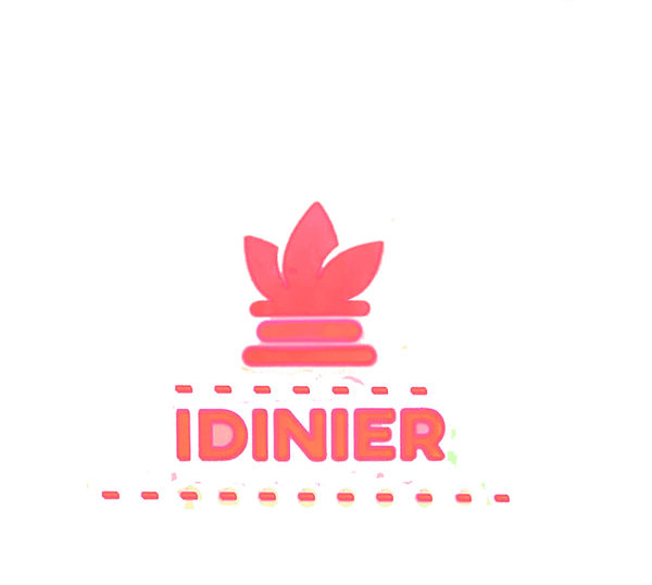
The first of two logo's for a client.The brief here being to create two logo's with the tagline being "Idinier". This logo being done with a pink neon finish.
The second of two logo's for a client. The brief here being to create two logo's with the tagline being "Idinier". For This logo I went for design showing the I as a candle but done with a 3d metallic effect
.jpg)
Another logo created for a client. This time with a Trojan motif with the name being Trojan Apparal with a gold and black colour scheme .
